Harry’s
PROJECT DISCIPLINES:
Shop design | Graphics | Print | Photography
BRIEF:
In a cityscape where tradition and modernity frequently converge, Harry’s unfolds as a quiet but deliberate dialogue between the two, a space that feels both disarmingly familiar and unmistakably contemporary.
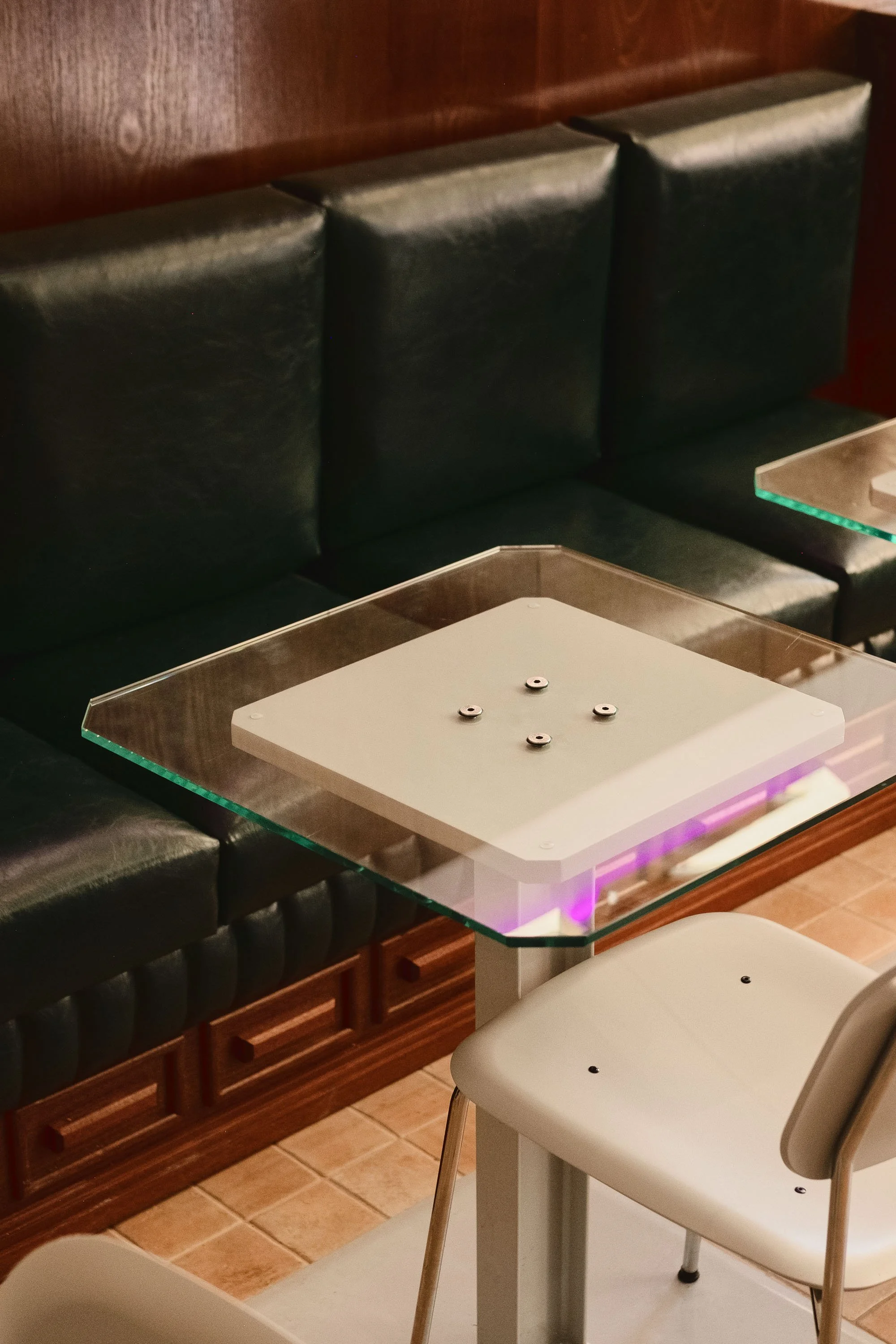
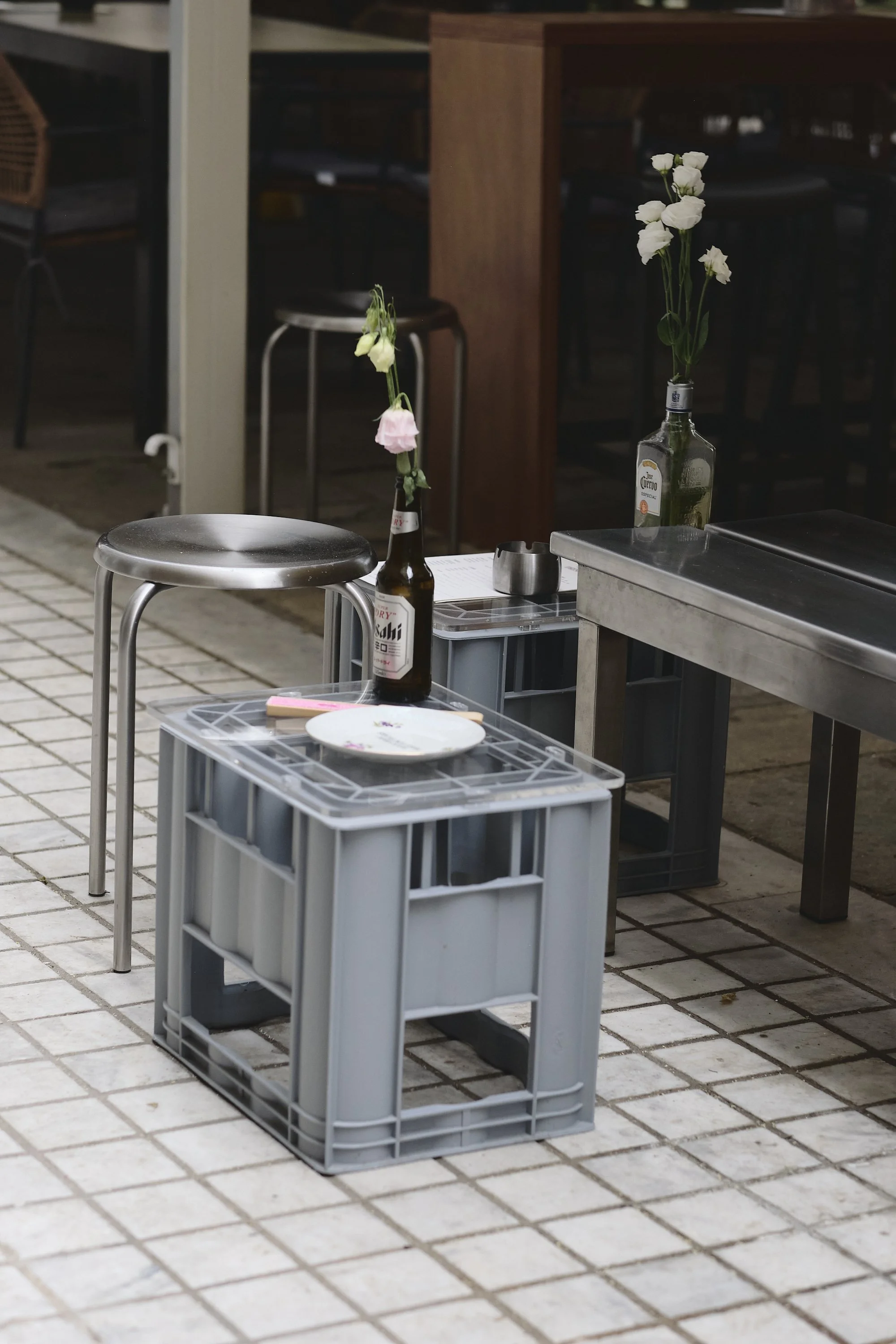
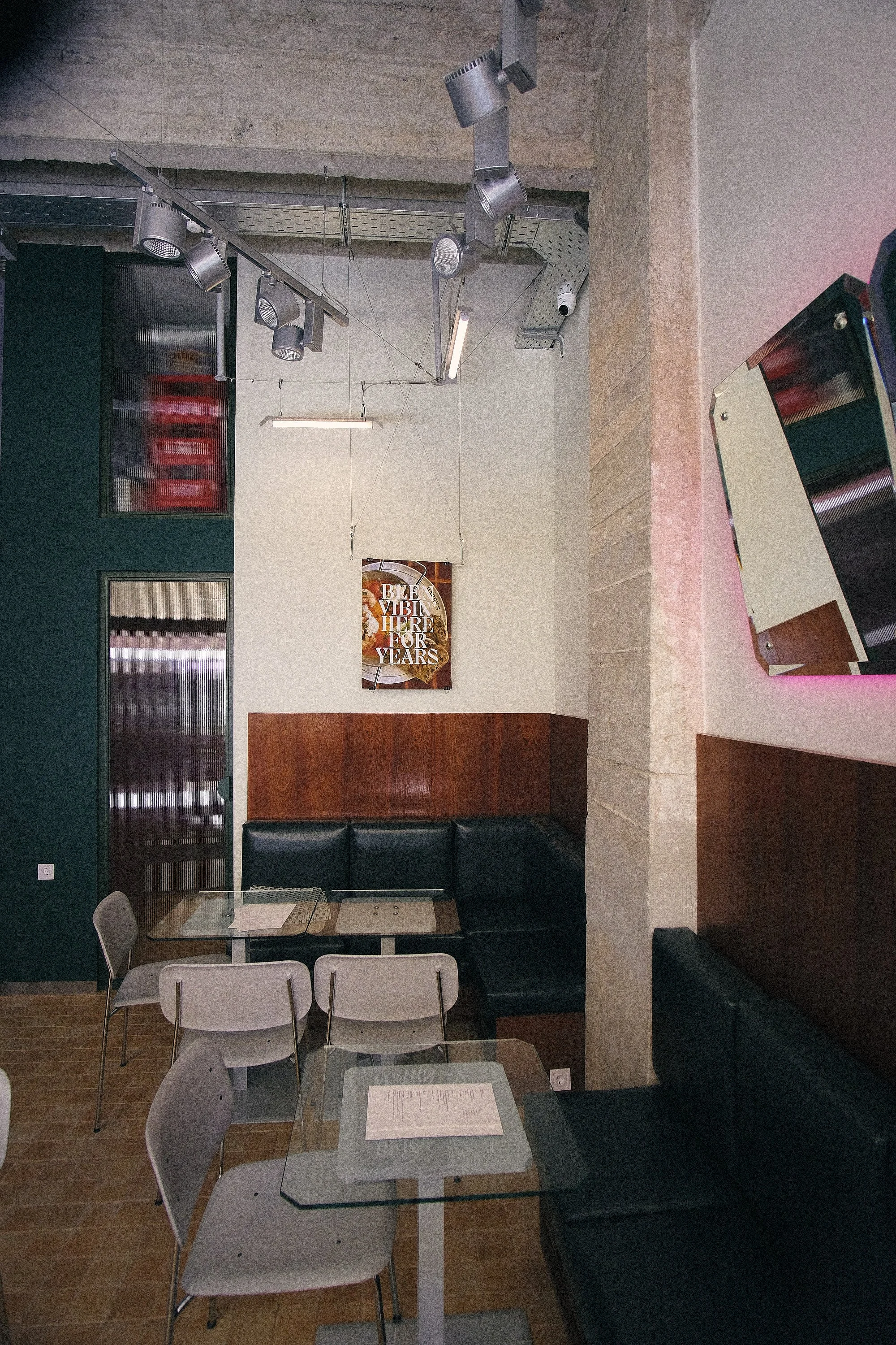
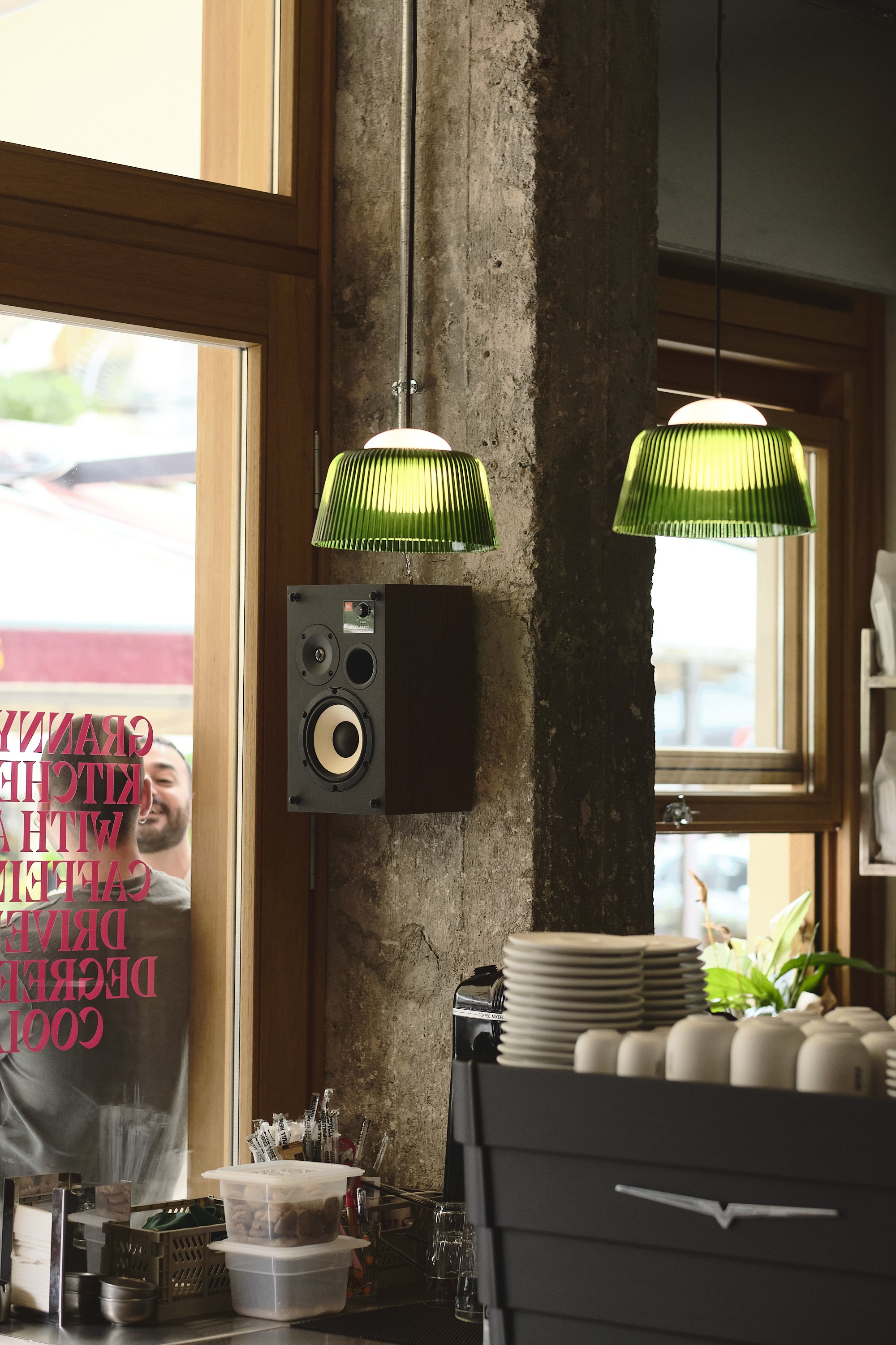
The project doesn’t simply reference the visual language of the urban café; it reframes it through a lens of material honesty, tonal restraint, and architectural precision. Visitors are welcomed by a rich, layered composition of surfaces: glossy oxblood ceramic tiles wrap the front bar, offset by exposed concrete columns, brushed steel details, and visible ceiling conduits, elements that celebrate the building’s utilitarian heritage. These industrial gestures are softened by tactile interventions: green leather upholstery and custom dark-wood joinery.
Light was treated as a narrative layer rather than a functional afterthought. Above the bar, HAY’s Brim Pendants in bottle-green glass contrast the stark stainless steel where on the opposite Marset’s Atlas fixtures light the classic dark wooden pass. These lighting choices not only shape mood, but reinforce the project’s chromatic language. Despite its spatial clarity, Harry’s resists over-definition. It doesn’t posture as retro or minimal, nor does it chase trend or nostalgia.
“Sometimes you enter a place and you feel that it has been loved and preserved for long time, it feels familiar without being introduced to it. Other times a brand new place sparks a sense of refreshing change, a new direction. We were looking to DISRUPT the familiar to surpass the norm, to achieve the sense of
"this must be the right place", not too old, nor too clinical, a place kept running and preserved”





Graphic identity/ packaging
The combination of seemingly unconventional ideas sometimes creates new pathways that feel refreshing. When we developed Harry’s, we moved towards this notion in both the visual identity and the spatial design for the shop.
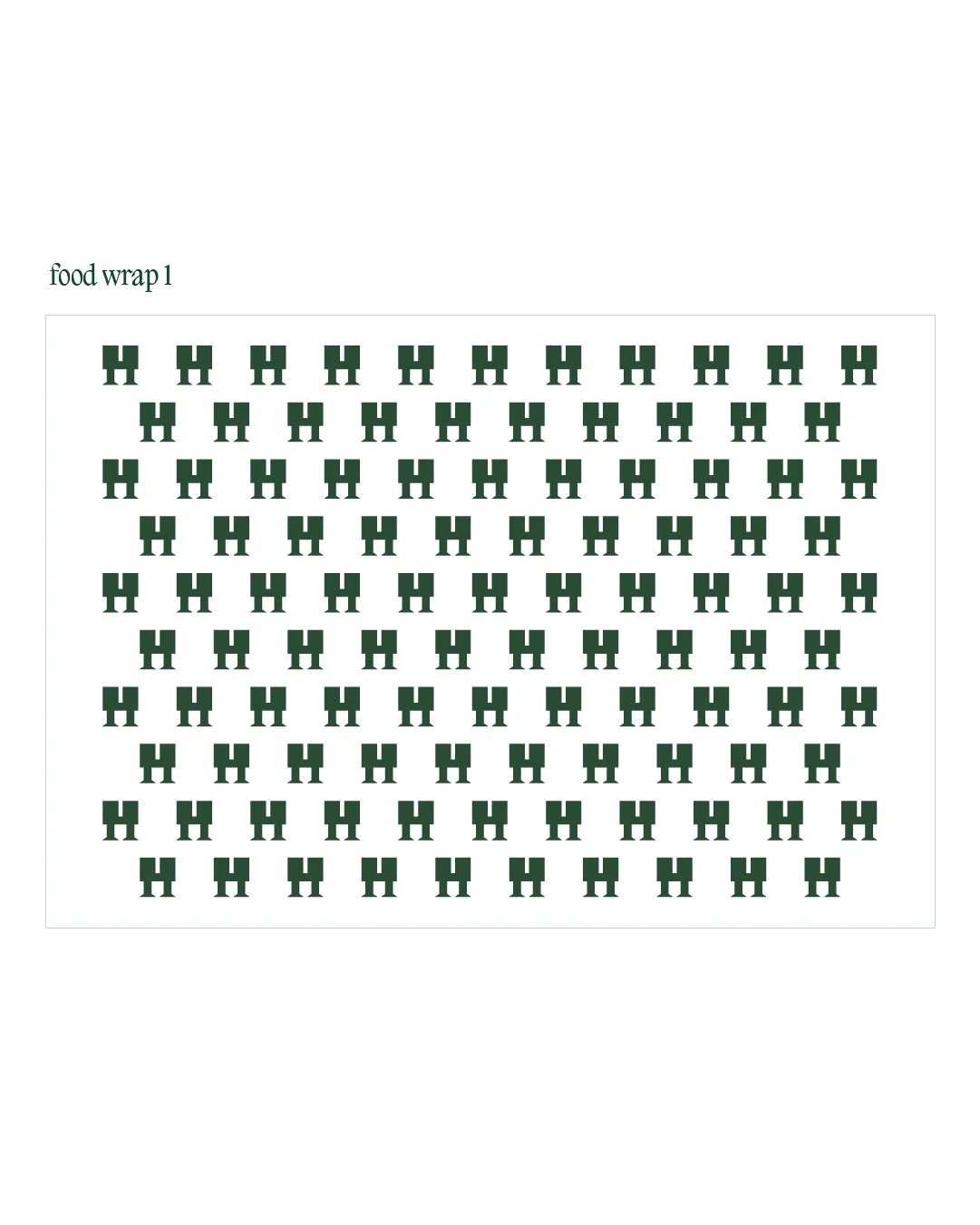
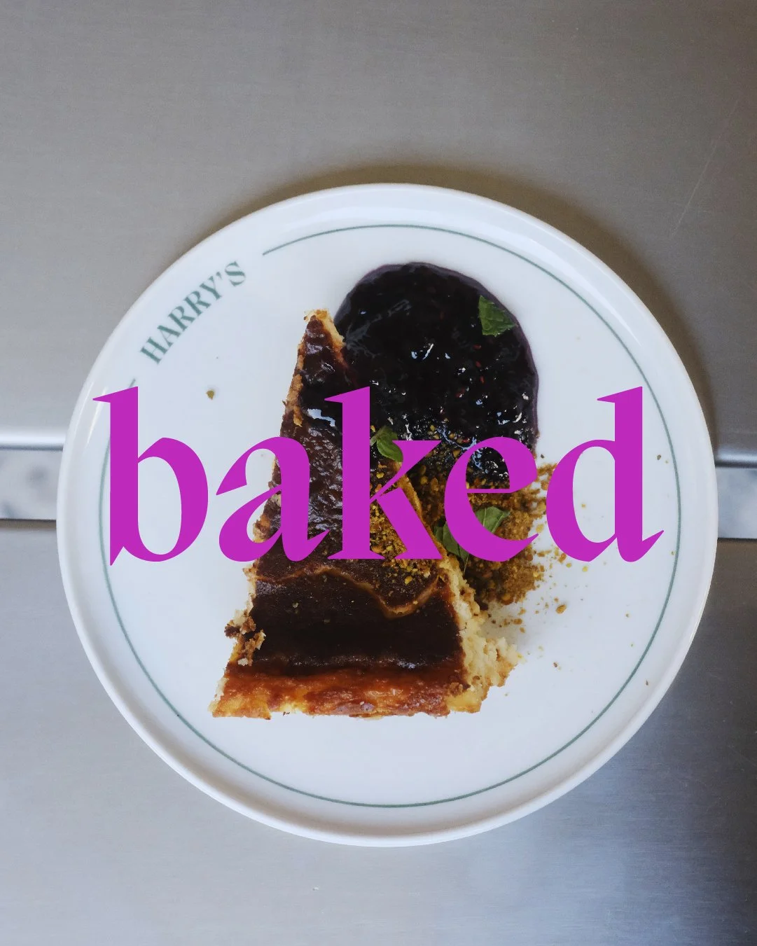
Harry’s brings together on its menus staples of street food culture like a classic, vintage-style BLT with inspired modern dishes and drinks.The graphic identity merges these aspirations classic/stable with fresh/modern by combining a sans-serif and serif “H”, creating an almost playful cartoon character with tiny serif legs: a small inside reference to Harry, the owner’s child who inspired the name. Contrasting brand colours support the concept, combining a dark, classic green with the vitality of a pure magenta.
Rounding out our approach, we created a number of applications — from staff T-shirts to the shop signage. Raw flash photography brings it all together, connecting the vitality of the place with its people.






3D visuals / construction


